Sketching in Architectural Practice
Overview
Before computers, before software, even before rulers, every design begins as a quick sketch. Sketching allows us to translate thoughts from our mind onto paper, fast and free, without the pressure of perfection. In architectural drafting and design, sketching is used to explore possibilities. With a pencil and paper, we can test out different building shapes, room arrangements, and façade ideas. A few simple lines can already suggest parts of a building, and a few quick boxes can represent spaces or volumes. These first sketches are not finished drawings—they are ideas in motion.

Sketching is also a language. It is how architects and drafters communicate with themselves, their team, and their clients. You don’t need to be a great artist. Even simple, rough sketches can powerfully explain a concept. What matters is clarity—your sketch should tell a story of space, proportion, and intention. As a designer or drafter, never underestimate sketching. It keeps you flexible and creative. It helps you think through problems before committing to detailed drawings. Whether in a notebook, on tracing paper, or even digitally on a tablet, sketching will always remain one of your most valuable tools in architectural design.
Introduction to Sketching in Architecture
When we talk about architecture, many people immediately imagine glossy renderings, perfectly aligned CAD drawings, or photorealistic 3D models. But the truth is, every great architectural idea almost always begins with something much simpler — a sketch. Sketching is the architect’s first language. It’s the quickest and most natural way to explore ideas, test spatial relationships, and communicate visions before any software comes into play.
Think of sketching as the bridge between your imagination and the real world. When an idea comes to mind, you can capture it in a matter of seconds with a pencil and paper. At this stage, accuracy is not the goal — clarity and expression are. A few strokes can convey concepts like “this is the living room,” “this wall might be curved,” or “this could be the entrance“. In fact, some of the world’s most iconic buildings were first born out of tiny, almost playful doodles that later matured into masterpieces. This is not about beauty; it is about logic, relationships, and flow. These rough sketches allow you to solve design problems before you even think of dimensions or construction details.
As you develop this skill, you’ll notice that sketching also helps you think visually. Instead of keeping abstract ideas in your head, the act of drawing them out forces you to test proportions, to organize thoughts, and to see what works or doesn’t. You’ll learn to use different line weights — thick lines for major outlines, thin lines for secondary details — and simple shading techniques to suggest depth, hierarchy, or materiality. These may look like small tricks, but they greatly enhance how your sketches are read by others.
And remember, sketching isn’t only for architects talking to clients. It’s also for you — the designer and drafter — to clarify your own thinking. Sometimes you don’t know what you really mean until you draw it. That’s why sketching should never be seen as a step to skip; it’s a habit to cultivate. In today’s digital world, some might assume sketching has lost its relevance. On the contrary, it has become even more valuable. With digital tools being so precise and rigid, sketching gives you the freedom to experiment and allows your creativity to thrive.
So, as we begin this journey into sketching techniques, remember one thing: sketching is not about being a great artist, it’s about being a clear thinker. You don’t need to draw perfectly; you just need to express your ideas convincingly.
Sketching Tools and Media
Every architect, designer or drafter has their own “toolbox” for sketching. Some carry a simple pencil and notebook everywhere, while others combine markers, pens, and digital tablets. What matters is not how expensive or fancy the tools are, but how well they help you capture and communicate ideas. Let’s go through the essentials.

Pencils
Pencils are still the foundation of architectural sketching. Their flexibility makes them the best starting point.
Grades:
- HB: for guidelines, faint outlines, light sketches.
- 2B–4B: for bold strokes, outlines, shading.
- 6B–8B: for deep shadows and expressive strokes.
- Mechanical pencils (0.3–0.7 mm) are excellent for precise lines and consistent weight.
- Wooden pencils are more versatile for varying line thickness.
Pens and Fineliners
Once confident with pencil, pens add clarity and permanence. They force you to commit to your lines, which trains discipline.
- Fineliner sets: 0.05 mm, 0.1 mm, 0.3 mm, 0.5 mm — useful for hierarchy in line weight.
- Felt-tip pens: smooth and bold, great for outlines.
- Brush pens: vary stroke thickness naturally, useful for quick silhouettes and trees.
Markers
Markers bring life to sketches by adding tone and quick shading.
- Gray markers (light, medium, dark) help show depth and distinguish planes.
- Colored markers add emphasis — for instance, green for landscaping, blue for water, red for circulation paths.
Use them lightly; too much color can distract from the architectural message.
Paper and Surfaces
The choice of paper affects how your sketches feel.
- Sketchbooks: portable, usually 90–120 gsm paper.
- Tracing paper: architects’ favorite. Thin, transparent sheets let you refine designs in layers — start with a bubble sketch, overlay with blocks, then refine outlines.
- Cartridge/drawing paper: thicker (150–200 gsm), suitable for ink and markers.
- Digital canvases: tablets simulate paper but with layers, grids, and infinite undo.

Page of an Architect Sketchbook
Supporting Tools
Even though freehand is key, a few aids help refine sketches:
- Erasers: kneaded (for smudging/shading control) and plastic (for precision).
- Templates: A template is a pre-cut drawing guide made of plastic or metal that helps designers quickly and accurately reproduce standard shapes, symbols, or elements in technical drawings. It improves precision, consistency, and speed in drafting and sketching. Templates speed up repetitive elements.
- Scales and rulers: for checking proportions, not for every line.
- Blending stumps: for smooth shading gradients.

Architectural Templates to Help Sketching and Manual Drafting
Digital Media
Digital sketching bridges tradition and CAD.
- Tablets: iPad (with Apple Pencil), Microsoft Surface, Wacom.
Apps: - Morpholio Trace: designed for architects, with trace overlays and perspective guides.
- Procreate: versatile, with custom brushes for pens, markers, and pencils.
- Adobe Fresco: natural brush strokes, vector + raster support.
- Advantages: infinite layers, quick duplication, color libraries, and easy sharing with clients.
Mixing Tools and Techniques
The best approach is often hybrid. For example: Start with a pencil sketch → trace it with fineliners → add marker shading → scan or photograph → enhance digitally on a tablet. Or, sketch digitally first, then print it out and refine with pencils/markers. The tools you choose shape your drawing style. A soft pencil sketch feels exploratory, a pen sketch feels confident, a marker sketch feels expressive, and a digital sketch feels refined. Drafters should experiment widely, then slowly curate a personal toolkit that makes them comfortable.
How to Use A Tracing Paper In Architectural Sketching
Tracing paper is a thin, semi-transparent drawing paper that allows designers to see an existing drawing underneath while creating a new version on top of it. In architectural training and practice, it is used to copy, study, modify, refine, or develop drawings step by step without altering the original plan. Because it lets you overlay ideas quickly, tracing paper supports design thinking, corrections, layout improvement, and progressive detailing in a clear and controlled way.

How the tracing process works:
First, place the original drawing flat on a table or screen. Then lay tracing paper over it and align it carefully so key reference points match. Next, trace only the main outlines—such as walls, grids, or boundaries—using light, controlled lines. After that, add secondary elements like doors, windows, stairs, furniture, and annotations. Finally, review the drawing, strengthen important lines, remove unnecessary guide marks, and separate the clean traced version for presentation or further development. This layered workflow helps designers explore ideas quickly and accurately while maintaining consistency with the base drawing.
Bubble Diagrams and Conceptual Sketching
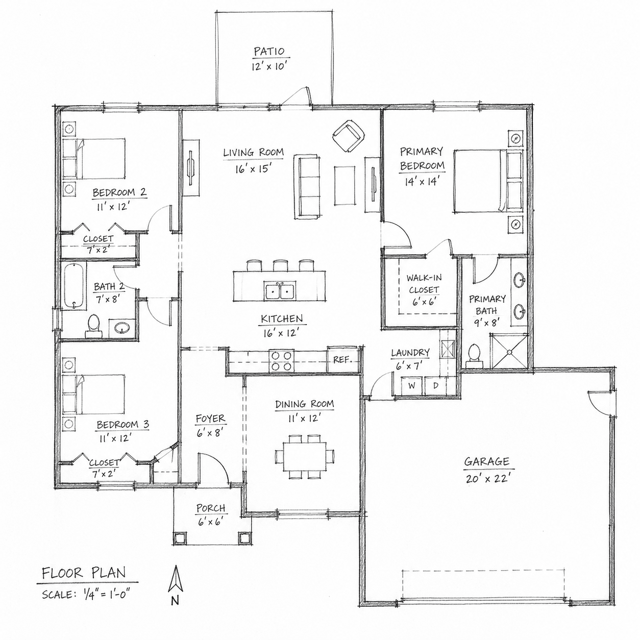
One of the very first techniques every architect and designer learns about sketching is: bubble diagrams. You might also hear them called bubble sketches, bubble drawings, or simply “bubbling.” This is the most intuitive way to start transforming abstract ideas into a spatial arrangement. Imagine you’ve been asked to design a small family house. You know it needs a living room, bedrooms, a kitchen, bathrooms, maybe a garage. But at this early stage, you don’t need walls, windows, or precise dimensions. What you really need to know is: how do these spaces relate to one another? Which spaces should be near each other, which should be separated, and how should people move between them?
This is where bubble diagrams come in. Each bubble represents a space or function. You might draw a big oval and label it “Living Room,” then a smaller circle nearby for “Kitchen.” You might place two bubbles side by side for “Bedroom 1” and “Bedroom 2,” and another circle tucked away for “Bathroom.” Without worrying about size or shape, you’re already mapping the relationships and hierarchies between spaces.

For example, in a house:
The kitchen bubble naturally connects to the dining bubble. The bedroom bubbles are grouped together but slightly away from the noisy living room bubble. The bathroom bubble attaches to the bedroom group but might also connect to a public circulation space. The bubble sketch gives you a visual logic. Later, these bubbles evolve into block diagrams, where shapes become more rectangular or linear to start suggesting walls and orientation. From there, the blocks become proper plans. But the very first bubbles are where you solve many of the biggest design questions — adjacency, hierarchy, and flow.
Another advantage of bubble sketching is its flexibility. You can erase and redraw, overlap bubbles, stretch them, cluster them — the goal is to explore many alternatives. Sometimes you’ll make three or four versions of the same project in just a few minutes, each with different arrangements. This speed of exploration is something CAD cannot offer at this early stage.
Bubble diagrams are not limited to houses. If you’re designing a school, bubbles might represent classrooms, administrative areas, playgrounds, or circulation. In an office, bubbles stand for open workspaces, meeting rooms, rest areas, or private offices. In urban design, bubbles might even represent whole blocks, parks, or traffic zones. The principle is always the same: simple shapes to test spatial logic.
Visually, bubble sketches are often drawn freehand with loose circles or ovals. Sometimes arrows are added to show movement or circulation, and lines may connect related functions. You don’t need a ruler or drafting tool — in fact, the rougher it looks, the better it communicates that this is an early-stage idea, open to change. Think of bubble diagrams as the “DNA” of your design. They contain the essence of how the project will function, even before it takes architectural form. That’s why they are so valuable for discussions with clients, colleagues, or even with yourself. A client may not understand a floor plan with dimensions, but they’ll immediately understand a bubble sketch showing the kitchen connected to the dining, or the garage leading into a utility area.
So, the next time you start a project, resist the temptation to jump straight into precise drawings. Begin with bubbles. Let them guide you. Because once your bubbles are clear, the whole design journey becomes smoother.
Freehand Linework and Shading
Now that you understand how bubble diagrams help organize spaces, it’s time to talk about the craft of sketching itself — the lines and shading that give your sketches life and clarity. Every drawing you make, whether it’s a rough idea or a polished sketch, is built on linework. And the quality of your linework often determines how readable, convincing, and professional your sketches appear.
The Importance of Linework
When sketching freehand, the line is your primary tool for communication. Unlike drafting with a ruler or in CAD, sketching lines are alive — they carry character. A confident line communicates assurance and clarity, while a hesitant, shaky line can make the drawing feel weak. This doesn’t mean every line must be perfect, but rather that your strokes should be intentional and expressive.
In architecture, linework also conveys hierarchy:
- Thick, bold lines for the main outlines (the profile of a building, the perimeter of a wall).
- Medium lines for secondary details (windows, doors, partitions).
- Thin, light lines for background information, furniture, or secondary references.

Common Lineweights Used in Sketching
Freehand Techniques
Practice drawing straight lines without a ruler. Practice drawing arcs, and smooth curves. One exercise architects often do is to fill a page with straight horizontal lines drawn freehand, then verticals, then diagonals. Over time, your muscle memory improves and your lines become more confident. Another good practice is to draw quick boxes, circles, and ellipses repeatedly until you feel comfortable.
When sketching, avoid “hairy lines” (many short strokes trying to make one long line). Instead, aim for long, clean, continuous strokes. Even if imperfect, a confident line reads better than a fuzzy one.
Shading and Hatching
Lines do not only define outlines; they also communicate depth, material quality, spatial hierarchy, and the effect of light. This is where shading and hatching play an important role in architectural sketching.
Hatching: parallel lines drawn close together. The closer they are, the darker the shade.
Cross-hatching: layers of lines crossing each other, used for deeper shadows or textures.
Smudging: using a finger or blending stump to soften pencil marks and create gradients.
Marker shading: flat areas of gray or color to emphasize planes and hierarchy.


Perspective and Proportion
When you move beyond bubble sketches and linework, the next challenge is to make your drawings look believable. This is where perspective and proportion come in. Without them, your sketches may feel flat or distorted. With them, you can make even the simplest drawing come alive, showing depth, distance, and scale.

Perspective in architectural sketching is a drawing method used to represent three-dimensional space on a flat surface in a way that matches how the eye naturally sees depth and distance. It shows how objects appear smaller as they move farther away and how parallel lines seem to converge toward vanishing points, helping designers communicate spatial relationships, proportions, and the real visual experience of a building before it is constructed.
Vanishing points are imaginary points placed on the horizon line in a perspective drawing where parallel lines appear to converge as they move away from the viewer. They do not exist physically in the drawing space but are mentally established by the designer to guide construction lines and create a realistic sense of depth and distance in architectural sketches.
The Logic of Perspective
Perspective is about how objects appear smaller as they move away from us. It’s a natural phenomenon, and learning to capture it is crucial for architectural sketches. There are three main types:
One-point perspective: Everything converges to a single vanishing point, usually used for looking straight down a hallway or street.

Two-point perspective: Objects converge to two vanishing points on the horizon, useful for corners of buildings or street views.

Three-point perspective: Adds a third vanishing point (up or down), giving a dramatic sense of height or depth — like looking up at a skyscraper or down from a tower.


In sketching, you don’t always need to construct perfect grids, but you should train your eye to imagine those vanishing points. For example, when sketching a room interior, try to align furniture and walls so they “flow” toward the vanishing point. This simple adjustment makes your drawing instantly more realistic.
Proportion in Architecture

Proportion is about the relative size of elements. A door that looks taller than a window in your sketch makes sense. But if the door is sketched wider than a living room wall, the whole drawing becomes confusing. That’s why you need to train your eye to keep proportions in check.
One method is to use human figures as a reference. In most sketches, drawing a 1.7–1.8 m tall figure (average human height) helps anchor scale. From there, you can estimate the height of walls, windows, or stair risers. Furniture also helps: a dining table is roughly 0.75 m tall, a chair seat around 0.45 m, a door about 2.1 m high. By memorizing these benchmarks, you can sketch spaces that feel consistent.
Sketching Architectural Elements
Architectural elements are not drawn the same way in every type of drawing. A plan view explains layout and relationships, an elevation explains height and vertical composition, and a perspective explains spatial experience and realism. For this reason, designers must learn to adjust how they sketch each element depending on the drawing type. The goal is always clarity, speed, and consistency rather than artistic decoration.


When learning architectural sketching, it is helpful to practice each element systematically in three steps: first in plan view, then in elevation, and finally in perspective view. This approach builds confidence and ensures that sketches remain technically meaningful.
Doors

In plan view, a door is represented by a rectangular leaf attached to the wall with a quarter-circle arc showing the swing direction. This arc is essential because it communicates circulation clearance and indicates how the space functions. Without the swing arc, the door symbol is incomplete.
In elevation view, a door is simplified into a vertical rectangle. A thin line may indicate the frame, and a small mark at handle height helps suggest realism without unnecessary detail. The emphasis here is on proportion and alignment with nearby openings.
In perspective view, the door should be drawn as a vertical plane with visible thickness if the wall depth is shown. Its height should remain consistent with standard residential proportions, typically about 2.1 meters, so that it can serve as a reference for scaling people and furniture around it.
Windows

In plan view, windows appear as openings within the wall thickness and are usually represented by two thin parallel lines. These lines indicate glazing and differentiate the window from a solid wall.
In elevation view, the window frame is outlined clearly, and glazing can be suggested using light diagonal strokes or subtle reflection lines. Avoid excessive detailing, since windows are repetitive elements and should remain visually controlled.
In perspective view, windows are represented by recessed openings or framed planes. Transparency can be suggested with a few parallel strokes, darker interior contrast, or light reflections rather than drawing interior details.
Furniture and Fixtures
Furniture and fixtures are essential elements in architectural drawings because they communicate how a space is used, how people move within it, and whether the layout functions correctly. A room drawn without them appears abstract and difficult to interpret. Once furniture and fixtures are added, circulation paths become visible, functional zones become understandable, and the drawing immediately gains realism and clarity.
It is important to distinguish between furniture and fixtures. Furniture refers to movable elements such as beds, chairs, sofas, and tables. Fixtures refer to elements that are attached permanently or semi-permanently to the building, such as kitchen counters, sinks, toilets, bathtubs, and wardrobes. Because fixtures are tied to plumbing, structure, or wall construction, they are usually drawn with slightly more positional accuracy than loose furniture.
Designers should learn to represent both categories clearly in plan view, elevation view, and perspective view, using simple graphic conventions rather than detailed illustrations.
Representing Furniture


In plan view, furniture is drawn using simplified geometric outlines that clearly communicate function without unnecessary detail. A bed is typically shown as a rectangle with two smaller rectangles indicating pillows, which immediately identifies the head direction and sleeping orientation. Chairs are represented as small squares or rectangles, sometimes with a short projection showing the backrest. Tables appear as circles, rectangles, or ovals depending on their shape. Sofas are drawn as elongated rectangles with internal divisions suggesting cushions. These simplified symbols allow viewers to quickly understand room usage and circulation space around objects.
In elevation view, furniture is represented by its vertical profile rather than its footprint. A chair becomes a seat line with a backrest rising above it. A table becomes a thin horizontal slab supported by vertical legs. A bed appears as a low horizontal block with a mattress line and sometimes a pillow outline. The objective is not decoration but correct height relationships between furniture, windows, and people.
In perspective view, furniture should be drawn as simple three-dimensional volumes placed correctly within the space. A table becomes a horizontal plane supported by four vertical legs. A sofa becomes a rectangular block with a secondary backrest volume. Beds appear as layered horizontal masses. Keeping furniture volumetric but simple helps communicate spatial depth efficiently without slowing down the sketching process.
Representing Fixtures


Fixtures require more precision than furniture because they are tied to construction systems such as plumbing, cabinetry, or wall installation. Their position is rarely arbitrary, so they must be drawn clearly and consistently.
In plan view, kitchen fixtures are typically represented as continuous counter rectangles with embedded symbols indicating appliances. A sink appears as a circle or rounded rectangle within the counter. A cooker is represented by a rectangle divided into burner zones. Refrigerators are drawn as larger rectangles placed along cabinet runs. In bathrooms, a washbasin appears as a rounded rectangle or oval, a toilet as a compact oval form with a tank extension if visible, and a bathtub as a long rectangle with curved interior edges. These symbolic representations are standardized so they remain readable even at small drawing scales.
In elevation view, fixtures are drawn according to their installed height and attachment condition. A countertop appears as a horizontal slab supported by vertical cabinet faces below. A washbasin is shown as a projecting curved form fixed to the wall or resting on a cabinet base. Toilets are represented with a seat profile and tank outline. Wall cabinets appear as floating rectangular volumes above counter level. These vertical relationships help explain ergonomic positioning and construction logic.
In perspective view, fixtures are represented as anchored three-dimensional elements integrated into the architectural space rather than floating objects. Counters should be drawn as continuous horizontal surfaces aligned with walls. Sinks appear recessed within these surfaces. Toilets and bathtubs should be drawn as solid installed forms touching floors or walls. The key objective is to show that fixtures belong to the building itself, not to movable interior arrangement.
Stairs

Stairs must always communicate direction and movement between levels. In plan view, stairs are drawn as a sequence of parallel lines representing treads, accompanied by an arrow showing the upward direction. The arrow is essential because it indicates level transition. In elevation view, stairs appear as a stepped profile formed by repeated riser lines. Only the rhythm of the steps needs to be suggested; drawing every tread in detail is unnecessary. In perspective view, stairs are represented using a diagonal progression of repeated horizontal edges that suggest depth. Emphasis should be placed on the slope line and step rhythm rather than individual measurements.
Trees and Landscaping

Vegetation provides environmental context and helps soften architectural geometry. In plan view, trees are represented as circles filled with loose texture or shading to suggest foliage mass. The trunk may be indicated with a small central mark. In elevation view, trees are drawn using irregular canopy outlines supported by a vertical trunk line. The objective is to show height and silhouette rather than botanical detail. In perspective view, trees should be drawn as layered organic masses. Focus on the overall shape of the canopy and its relationship to the building rather than individual leaves.
People and Vehicles


Human figures and vehicles help establish scale and improve spatial understanding. In plan view, people are represented by small circular heads with shoulder ellipses, while cars appear as rectangles with rounded corners and wheel positions suggested lightly. In elevation view, people are drawn as simple silhouettes without facial details. Their height should relate logically to doors and windows. Cars are represented as horizontal profiles with wheels and rooflines indicated minimally.
In perspective view, people can be drawn as stick figures or simplified body blocks placed naturally within the scene. Cars should be represented as basic three-dimensional volumes with curved rooflines and visible wheel positions. These elements should support the drawing rather than dominate it.
A Practical Method for Learning Representation
The most effective way to learn architectural sketching is to practice each element in sequence across the three drawing types. Start by sketching the element in plan view to understand its position and footprint. Then draw it in elevation to understand height and proportion. Finally, draw it in perspective to understand spatial presence. Repeating this process trains you to think like an architect rather than an illustrator and helps you develop a reliable visual vocabulary that can be used quickly during real design work.
Application
Begin by getting a simple sketchbook dedicated to your architectural practice. Then reproduce all the illustrations presented in this article from beginning to end, including their notes and construction lines where applicable. Use only basic tools you are comfortable with—a simple pencil is enough. The goal is not perfection, but to train your observation, coordination, and understanding of how architectural drawings are progressively developed through sketching.
Conclusion
Sketching remains one of the most powerful tools in architectural practice because it connects observation, thinking, and communication in a direct and flexible way. Whether used to explore early ideas, study proportions, understand spaces, or explain concepts to clients and collaborators, sketching helps architects and designers develop clarity before precision. By practicing regularly, designers strengthen their ability to see, interpret, and shape the built environment more confidently and creatively. In architecture, a simple sketch is often the first step toward a meaningful project.